Watercolor Architectural Rendering: When Less Realism Communicates More
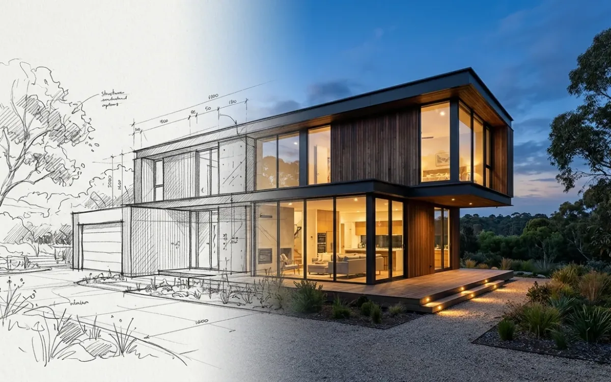
A watercolor architectural rendering says one thing: this is an idea, imagine it with me. A photoreal render says something else: this is finished, approve it. Same building, same drawing, two different sentences to the person across the table.
Most practices only own the second sentence.
This piece is about the first one. When the watercolor register beats photorealism, what makes an image read as real paint instead of a filter, and how to produce one today, from actual brushwork to AI, without the years of practice the medium used to demand.
Why less realism sometimes communicates more
Start with the worry, because the worry is correct. Architects put it plainly: "you show this level of info to a client and they think… the design to be complete."
Show a photoreal render at concept stage and two things go wrong at once. The client believes the design is further along than it is. And their feedback moves to finishes and furniture, the things photorealism renders most legibly, exactly when you needed reactions to massing, light and atmosphere.
A watercolor does the opposite. Soft edges and a visible hand say: in progress, still open. Atmosphere carries the message instead of material specification. The client reacts to how the space feels instead of auditing the countertops.
Planning presentations shift the same way. A watercolor of a contested infill project reads as considerate intention. A glossy render of the same building reads as a done deal, and neighbours respond to done deals accordingly.
So the answer is not withholding realism. Clients cannot read plans, and realism is the only language they are fluent in. The answer is deciding how much of it each moment deserves.
Staged realism is the practice of setting an image's realism level to match the decision on the table, so the picture tells the client how finished the design actually is.
Early and contested: watercolor. Late and decided: photoreal. The professional move is not watercolor versus photorealism. It is holding both registers and choosing per moment. (The general version of this idea, realism as a deliberate dial across a project, runs through everything I publish on presentation strategy.)
What makes watercolor read as watercolor
Whether the image came from a brush or from a model, the register depends on a few honest mechanics. Learn them and you can judge any output in seconds, including your own.
- Reserved whites. Real watercolor keeps the paper for the lightest values. Nothing white is ever added. Images where the lights glow from underneath are genuine; images where white sits on top as paint are a filter.
- Granulation and blooms. Pigment settling into the tooth of the paper. Hard rings where a wash dried unevenly. Perfect gradients betray digital origin instantly.
- Edges of more than one kind. Paint meeting dry paper gives a hard edge. Paint meeting wet paper gives a soft one. A real sheet carries both, often within one wash. A single uniform edge quality across the whole image is a machine signature.
- Confident incompleteness. Good architectural watercolors stop. An edge dissolves, the context fades to bare line, one corner stays paper. Full-bleed uniform detail is the giveaway of an automated watercolor effect.
- A restrained palette. 2 or 3 pigments doing all the work, including the greys, which get mixed from those same pigments rather than dropped in from a tube. Full-gamut colour reads as digital.
- Line and wash cooperating. Most architectural watercolor sits on a light line drawing. The wash brings light and mood. The line keeps the architecture precise. Lose the line and you lose the building.
Architects underestimate that last one. A watercolor is not a vaguer image. It is a precise drawing with a loose surface, which is why it stays open about the design while staying exact about the geometry.
3 ways to produce a watercolor architectural rendering in 2026
Paint it. Unbeatable authenticity, real hours, and a skill with a long ramp. If you or someone in the office paints, an original still carries presence in a competition or a client room that no printed file matches. Time per image: hours to days.
Digital painting. Procreate or Photoshop with watercolor brush sets. Faster iteration than paint, still a genuine skill, output quality tracks the operator. Time per image: hours.
AI, from your own drawing. Upload a sketch, an elevation or a model screenshot, pick a watercolor style, get the rendering back in about 30 seconds.
I build SecondRender, so check what follows against your own output. The useful part is not the speed. It is repeatability: a style is a saved, reusable visual identity, so once a watercolor look works for your practice you apply that same style across every image in the project. A one-off filter cannot do that, which is why filter-based watercolor boards never look like a set.
The honest part: generative models do not return the same output for the same input. Expect variations on your style rather than identical brushwork, and judge every result against the mechanics above. Weak AI watercolor fails exactly where filters fail, with uniform detail, dead gradients and one edge quality everywhere. That limit belongs to the category, not to one product. The only fair question is what a given tool does to manage it.
None of this replaces the painter. An architectural watercolor made by someone who has painted for years carries something a model does not produce, and the boards that win with one have earned it.
What the third path changes is access. The watercolor register becomes available to practices that never had it, because the same drawing that produces your photoreal render can now produce its watercolor sibling. For most architects the alternative was never a commissioned painting. It was no watercolor at all, and one register for every conversation.
Where a watercolor architectural rendering earns its keep
- Concept and schematic client presentations, where openness is the message
- Planning and community consultation for sensitive or contested contexts
- Competition boards aiming to stand apart from a wall of glossy renders
- Marketing for heritage, hospitality and residential projects, where warmth sells
- Paired sets: watercolors for atmosphere plus 1 photoreal hero for credibility, on the same board
Try the paired set first. It stages realism inside one presentation and shows the client the difference between an open question and a settled answer.
Test the register with your own linework
If you try the AI route, run it on your own drawing, not on a demo image, and check 4 things. Are the whites luminous rather than painted on. Does anything dissolve at the edges. Is the palette restrained. Does your architecture stay precise under the wash.
Yes to all 4 and you have the register. If the output looks like a photograph with a texture overlay, keep looking.
For the broader map of rendering approaches and what each one costs, start with the complete guide to architectural rendering.
And if you want to see staged realism running end to end, book a free 30-minute demo. I will show you a live render from scratch and answer every question.