Architectural Presentation Boards: Layout, Hierarchy, and the Realism Question
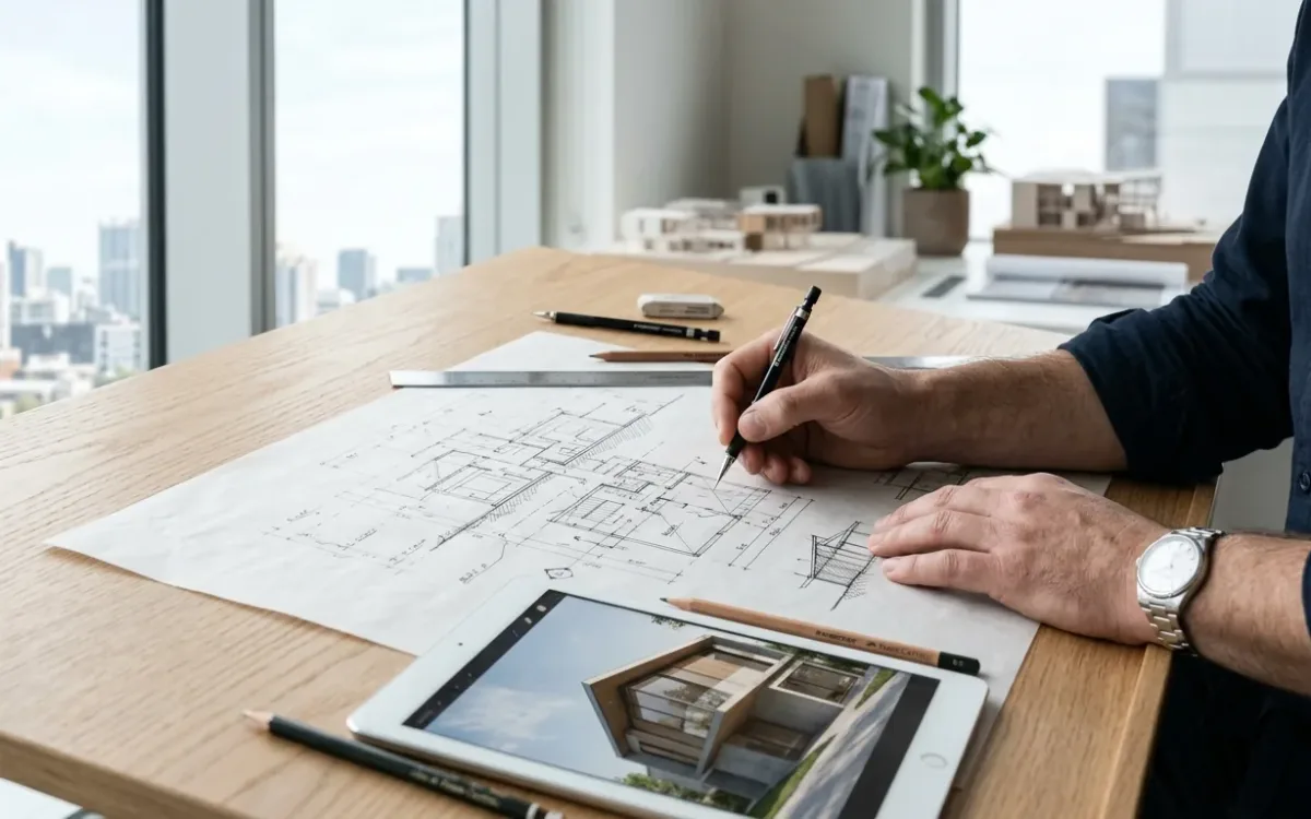
Architectural presentation boards are decided in the first 5 seconds of looking. Most boards lose those 5 seconds the same way: they get built as a container for everything the project has, instead of an argument for one idea. This guide covers the layout, the content selection, and then the question almost nobody addresses directly: how much realism your imagery should carry at each stage, because that choice quietly steers what your audience believes about the project.
One board, one argument
A competition juror spends under a minute per entry on the first pass. A planning committee sees your board after 14 others. A client sees it at the end of a workday. None of them will assemble your intent out of fragments.
So before layout, write the one sentence the board has to prove. Then every drawing, render and diagram either serves that sentence or comes off the board.
That single rule separates a working board from a beautiful archive. If the sentence is "the building opens the street corner to the park", the hero image shows the corner, the site plan proves the connection, and a section earns its place only where it demonstrates the opening. The facade study you love goes in the appendix.
Layout: how architectural presentation boards earn a reading path
The eye needs a path, and you are the one who chooses it.
- One hero, always. A single dominant image at roughly 40 to 50 percent of the board carries the argument. Two equal images split the vote and lose it.
- Reading gravity. Top-left to bottom-right in Western contexts. Put the hero on that diagonal and the supporting material downstream of it.
- A real grid. Pick a column grid and obey it. Misalignment reads as carelessness at exactly the distance a jury stands.
- White space is content. Empty area directs attention. The most common board failure is filling it.
- Text discipline. Title, one sentence of concept, short annotations. Nobody reads paragraphs standing up. If the board needs a paragraph, the drawings are not doing their job.
- One graphic language. One line weight logic, one shadow direction, one color temperature across every image. Mixed render styles on one board read as mixed authorship.
What earns a place on the board
The standing set, filtered through your one sentence: the hero image, a site plan, the fewest key plans that carry the idea, 1 or 2 sections where the section is the idea, diagrams for what a picture cannot show (circulation, program, climate), and a detail only when the detail is the argument.
Model photos and process sketches are welcome when they show thinking. Not when they fill space.
The realism register: how photoreal should architectural presentation boards be?
Start with the fear, because it is real and it is earned. Architects say it plainly: "you show this level of info to a client and they think the design to be complete." Show a polished render at concept stage and the feedback comes back about the wrong things. The jury critiques your material choices when you wanted them evaluating the massing. The client treats an open question as a closed decision.
The usual response is to withhold realism. That fails too, for a reason worth naming: clients cannot read plans. Realism is the only architectural language most of them are fluent in. Take it away and you have not protected the design, you have just made yourself harder to understand.
The fix is not less realism. It is realism you control.
Realism is not a quality dial you push to maximum. It is a communication register. A photorealistic hero image says "this is what you will get." A styled or diagrammatic image says "this is what we intend." Your audience hears the difference whether or not they can articulate it.
Staged realism is matching the realism of each image to the maturity of the decision it represents, so the image tells the truth not only about what the design looks like, but about where the design stands.
In practice that means 3 registers, chosen on purpose:
- Concept boards. Diagrammatic and styled imagery. Realism withheld deliberately, because the decisions underneath are still open and you want them discussed.
- Design development. A realistic hero to prove the idea lands in the real world, styled support around it to signal which questions are still live.
- Final and competition boards. Full realism, because here the argument genuinely is "this will be built and it will be good."
Until recently this was not really a choice. Producing one photoreal hero for one board meant days of rendering work or an outsourcing invoice, so boards defaulted to whatever imagery was cheapest to produce, and the realism register was set by the budget rather than by the argument. That constraint has mostly dissolved. AI rendering turns a sketch or a model screenshot into a photorealistic image in about 30 seconds, which finally makes the register of every image on your board a decision instead of an accident. (How that works, limits included: sketch to render, step by step.)
Two honest limits come with it, and a board is exactly where they bite. Generative models do not guarantee the same output from the same input, so 2 runs of one prompt will differ. And carrying an object rendered with all the detail you want into another perspective is still a genuine challenge across the category. A board demands one graphic language across 6 or 8 images. That consistency is the actual work now, not the rendering. Plan for it: generate more images than you need, then select for a matching light direction, time of day and color temperature, and treat the hero as the anchor every other image on the board has to agree with.
Format practicalities
- Work at final size from day 1. Scaling up later softens everything.
- 150 dpi is enough at viewing distance. 300 for boards that get handled in a review.
- Export the PDF version before the print version. Half of all boards are seen on a screen first now.
- Check the board at thumbnail size. If the hierarchy survives at 10 percent zoom, it survives the room.
The five-second test
Pin the board to a wall. Walk to the far side of the room. Give it 5 seconds.
Then ask someone who has never seen the project: what is the one thing this project does?
If the answer is your sentence, the board is board-ready. If it is not, you do not have a beauty problem, you have a hierarchy problem, and the fix is almost always subtraction. Take something off. Then ask again.
Two questions decide a board, and they are worth writing at the top of the layout file before you place a single image. What is the one sentence? And for each image on it: does the realism of this picture match how settled the decision behind it actually is?
For the wider context on how presentation imagery gets made and what each path costs, see the complete guide to architectural rendering.